<img height="1" width="1" style="display:none" src="https://www.facebook.com/tr?id=920006783769328&amp;ev=PageView&amp;noscript=1">
Documentation

Advanced Feature Cards


The Advanced Feature Cards Module is a flexible and visually engaging component designed to showcase multiple services, features, or key offerings in a structured card layout. Each card can include a custom icon, title, description, feature list, and call-to-action link, allowing content editors to highlight important information clearly and consistently. The module supports multiple cards with customizable content and styling, making it suitable for creating responsive feature sections across different pages while maintaining a consistent visual design.
feature-cards

What is the Advanced Feature Cards Module?

The Advanced Featured Cards Module is a customizable card-based section designed to highlight key services, features, products, or offerings in a visually structured layout.

Based on the provided design, the module includes:

  • Multiple featured cards displayed in a responsive grid layout.
  • Custom icon or image for each card.
  • Card title to highlight the primary feature or service.
  • Short description for additional context.
  • Customizable feature list with bullet points.
  • Call-to-action link/button, such as β€œLearn More,” with an optional arrow icon.
  • Individual card styling, including border, spacing, background, and hover effects.
  • Responsive design to support desktop, tablet, and mobile layouts.

Each card can be managed independently, allowing content editors to add, remove, reorder, or customize cards based on the page requirements. This module is suitable for showcasing service categories, product benefits, development offerings, or other key business features.

How does the Advanced Feature Cards functionality work?

  • Dynamic Card Management: Add, remove, and reorder cards dynamically based on the content requirements without modifying the module code.
  • Section Content Options: Add a preheading, heading, and description to introduce the featured cards section and provide additional context.
  • Custom Card Content: Configure an individual title and description for each card to highlight different services, features, or offerings.
  • Feature List Content: Add multiple list items within each card to display key features, benefits, or important information.
  • Custom CTA Button: Add a customizable button to each card with editable button text and destination link.
  • Content Style Customization: Update the styles of the preheading, heading, description, card content, list items, and buttons, including typography, colors, spacing, and alignment.
  • Individual Card Styling: Customize the appearance of each card, such as background, border, border radius, padding, and other visual styling options.
  • Flexible Column Layout: Change the number of card columns to control how many cards are displayed in each row.
  • Responsive Design: The card layout automatically adapts across desktop, tablet, and mobile devices to ensure a consistent user experience.


What customization options are available with the Advanced Feature Cards Module?

Below is a list of all the customization options available for the Advanced Feature Cards.

Content

Drag and drop the Scroll Animation Cards into your desired location on the page.

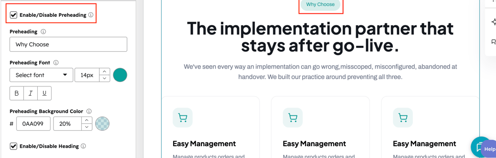
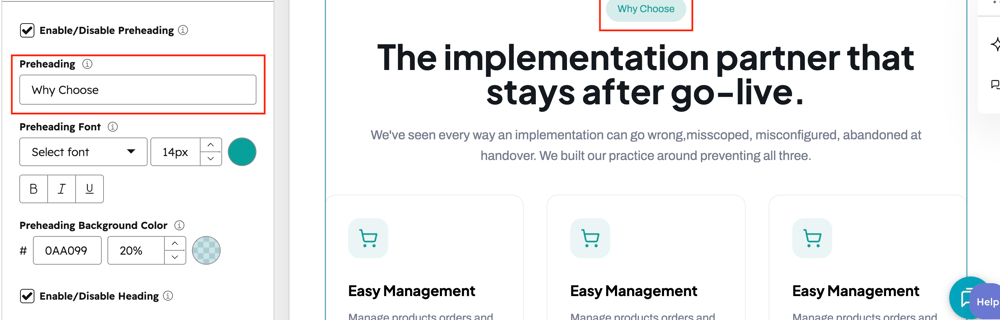
preheading

User can add the preheading text on respective text field.

enable-preheading

User can enable/disable preheading using respective checkbox field.
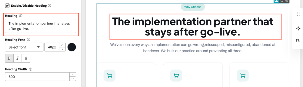
Heading

User can add the heading on the respective text field.

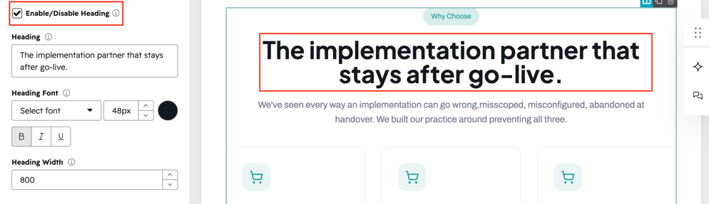
enable-Heading

User can enable/disable heading using respective checkbox field.
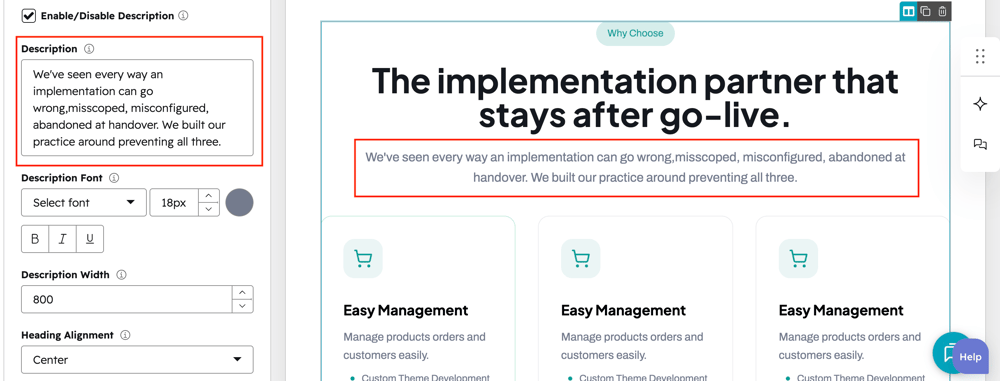
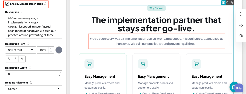
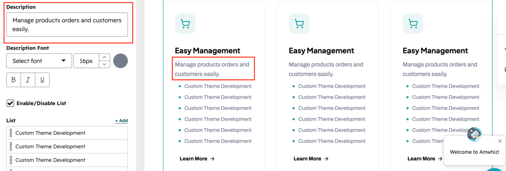
description

User can add the description on the respective text field.

enable-description

User can enable/disable description using respective checkbox field.

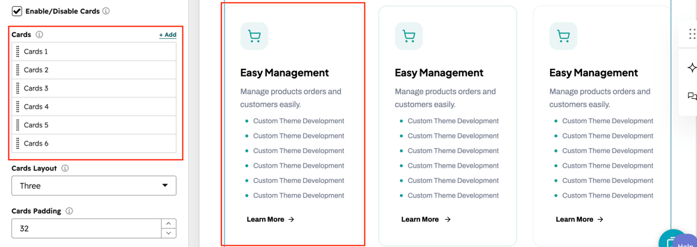
cards-add

Users can add the multiple card using respective repeater field.

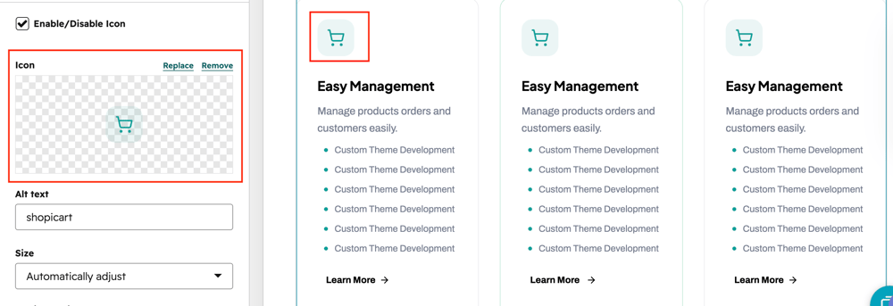
card-icon-1

User can add the icon each cards using respective image field.

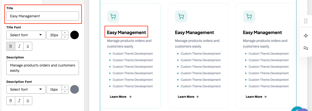
card-title-2

User can add the title on each cards using respective text field.

card-description-1

User can add the description on each cards using respective text field.

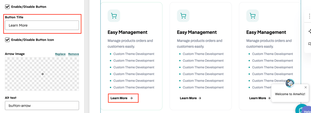
cards-btn-title

User can add the button text on each cards using respective text field.

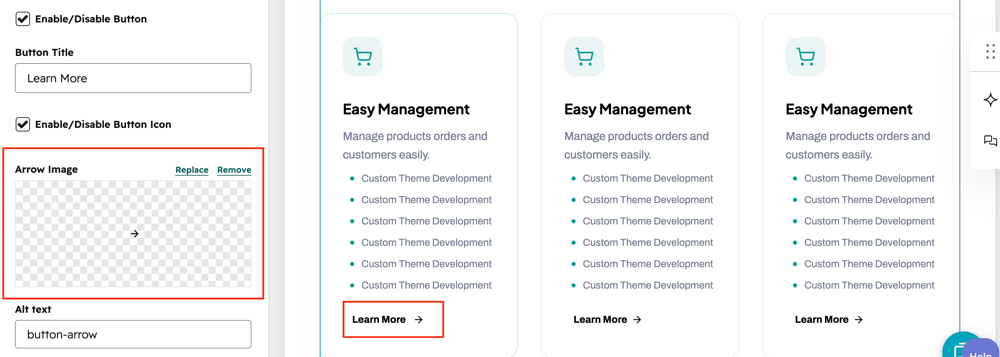
button-icon

User can add the button icon on each cards using respective image field.

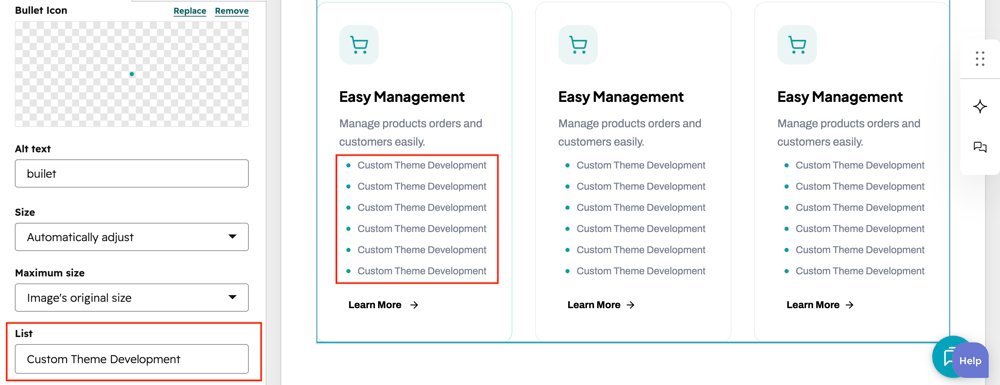
card-list-item

User can add the featured lists on each cards using respective repeater field.

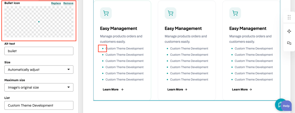
list-icon

Users can add the feature list item icons on respective image field.

What customization styles options are available with the Advanced Feature Cards Module?

below list of customization style options are available for Advanced Feature Cards Module.

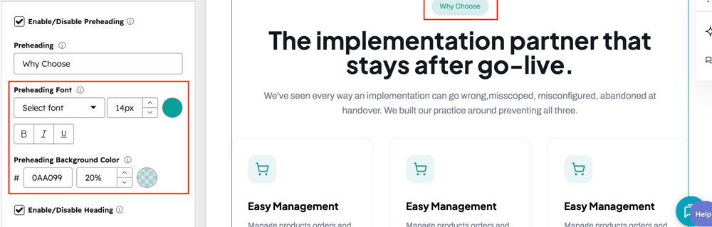
preheading-styleUsers can change the preheading styles such as font and colors using respective style fields.
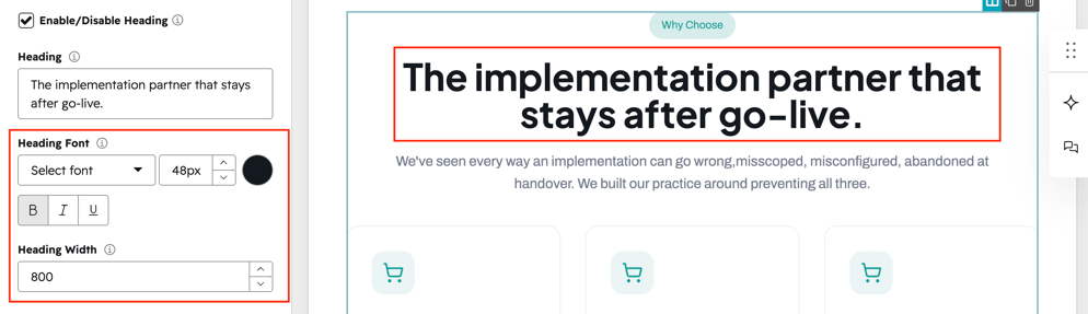
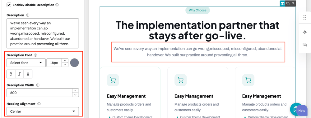
Heading-style

Users can change the heading styles such as font and colors using respective style fields.
description-style-1

Users can change the description styles such as font and colors using respective style fields.
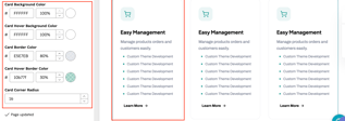
card-styles

Users can change card styles such as background color,border,hover border color and corner radius using respective style fields.

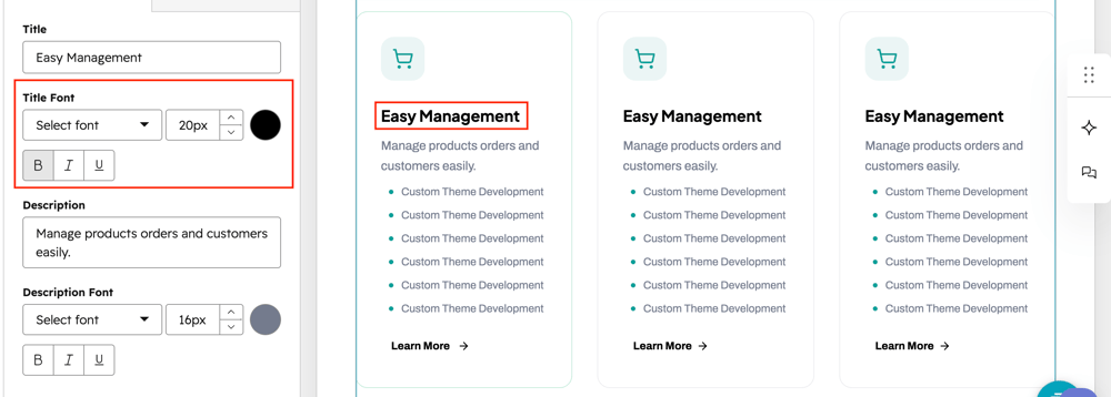
card-title-style

Users can change the cards title styles such as font and colors using respective style fields.
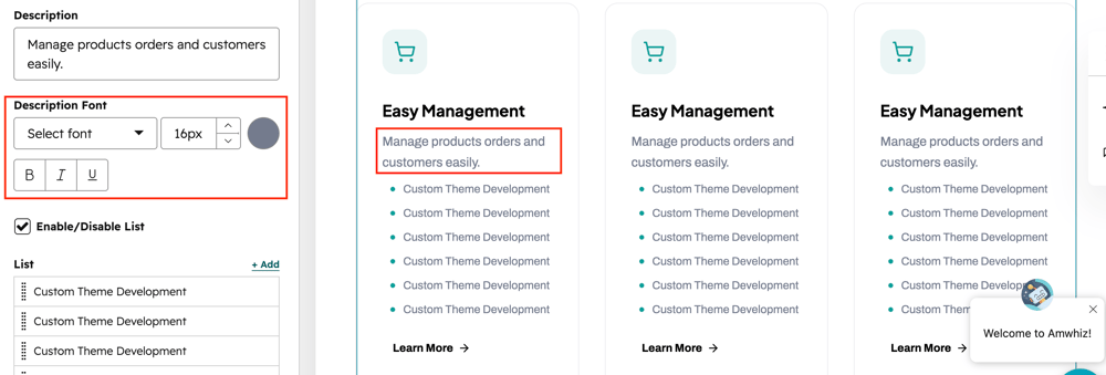
card-desc-style

Users can change the cards description styles such as font and colors using respective style fields.
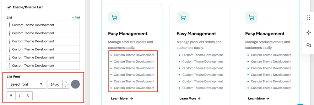
card-list-styles

Users can change the cards feature list styles such as font and colors using respective style fields.
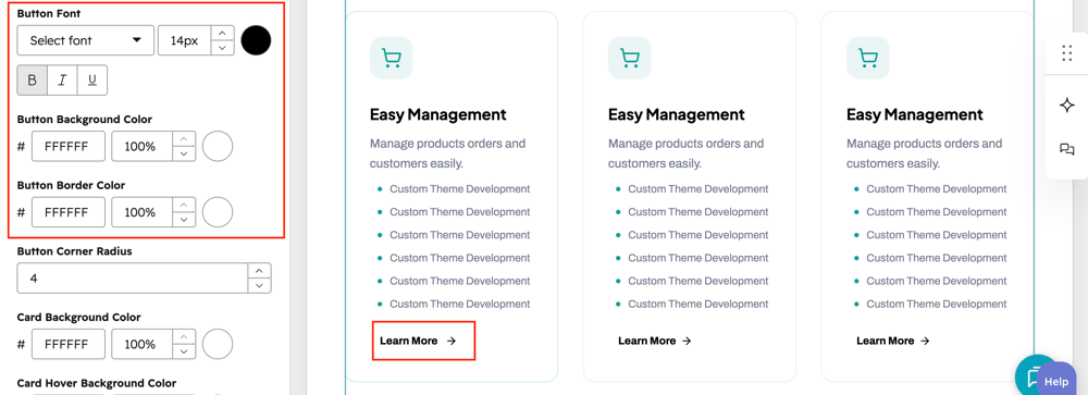
button-styles

Users can change the cards button styles such as font,color and background colors using respective style fields.
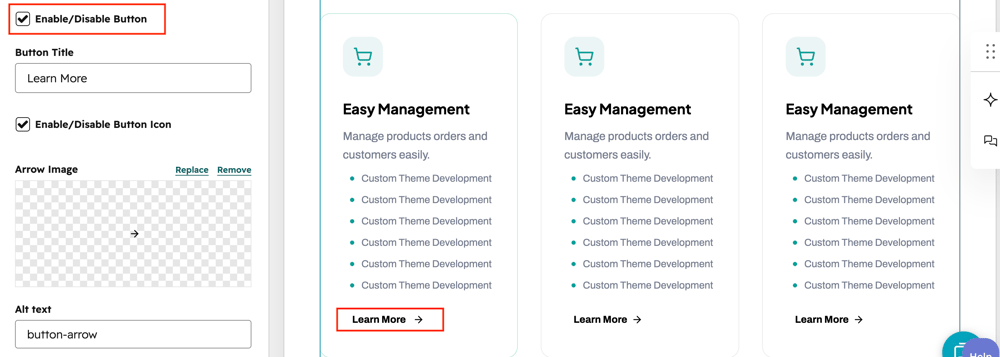
enable-button

User can enable/disable card button using respective checkbox field.

How can I get support?

If you're still having trouble or have any questions or feedback, contact at  hello@amwhiz.com