<img height="1" width="1" style="display:none" src="https://www.facebook.com/tr?id=920006783769328&amp;ev=PageView&amp;noscript=1">
Documentation

Discovery Timeline Cards


This Discovery Timeline Cards presents a chronological sequence of key milestones, discoveries, or events in an easy-to-follow alternating card layout. A central vertical timeline connects each milestone, while the left and right positioned cards improve readability and visual balance. Each timeline card includes the year, title, description, and an additional detail (such as the scientist, contributor, or category), making it suitable for showcasing historical events, project phases, company milestones, product evolution, research discoveries, or any sequential process.

Discovery Timeline cards

What is the Discovery Timeline Cards Module?

This Discovery Timeline Cards presents a chronological sequence of key milestones, discoveries, or events in an easy-to-follow alternating card layout. A central vertical timeline connects each milestone, while the left and right positioned cards improve readability and visual balance

How does the Discovery Timeline Cards Module functionality work?

The Discovery Timeline Cards Module allows users to present chronological events, milestones, or project stages using an alternating card layout along a central timeline. Each timeline item is displayed as an individual card connected to the timeline, making it easy to visualize the sequence of events.

Functionality

  • Add Timeline Items: Create multiple timeline cards, each representing a milestone or event.
  • Year Badge: Display a year or date at the top of each card to indicate when the event occurred.
  • Content Fields: Each card supports a title, description, and an optional secondary field (such as a scientist, author, category, or location).
  • Alternating Layout: Cards automatically alternate between the left and right sides of the timeline for better readability.
  • Central Timeline: A vertical timeline with milestone indicators visually connects all cards in chronological order.
  • Responsive Design: The module adapts across desktop, tablet, and mobile devices while maintaining a clean, organized layout.
  • Customizable Styling: Colors, typography, spacing, and card appearance can be customized to match your website's branding.

This module is ideal for displaying historical timelines, company milestones, project roadmaps, product evolution, educational content, research discoveries, and other chronological stories.

What customization options are available with the Discovery Timeline Cards Module?

Below is a list of all the customization options available for the Discovery Timeline Cards

Content

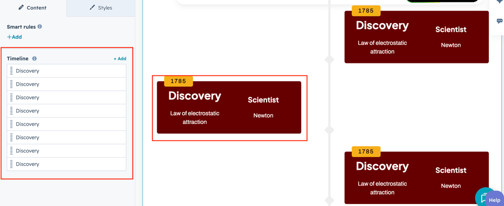
Drag and drop the Discovery Timeline Cards into your desired location on the page.

Card-group

The drag and drop the module default show review Discovery Timeline Cards group to change the content.


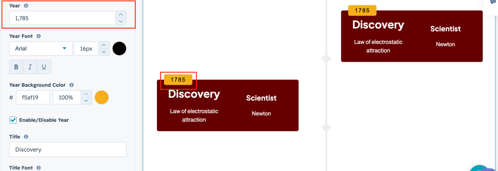
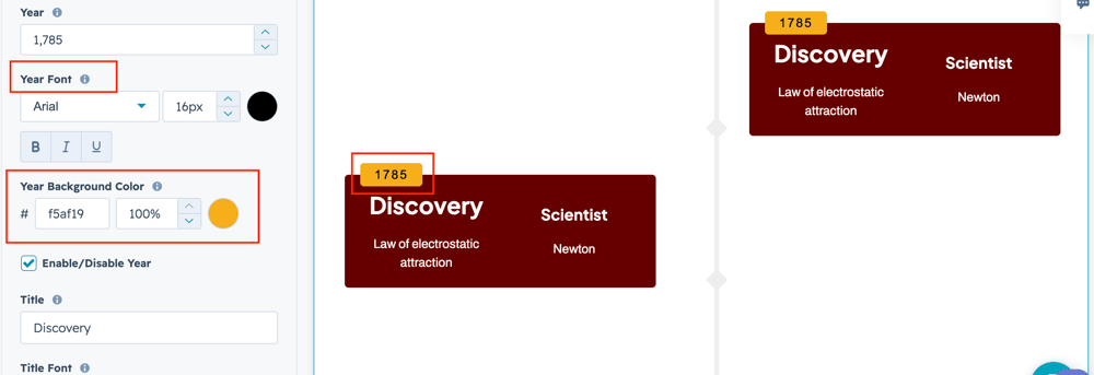
Year-field


Add a year for the respective text field to clearly indicate its purpose and guide users in entering the appropriate content.

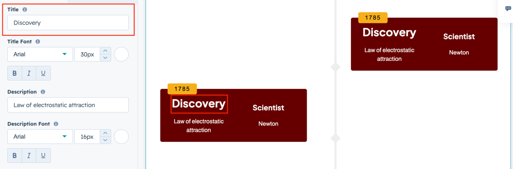
title-field

Add a title for the respective text field to clearly indicate its purpose and guide users in entering the appropriate content.


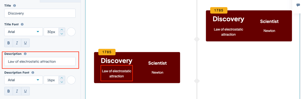
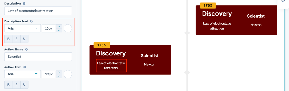
description-field

Users can also add description in the respective text field.


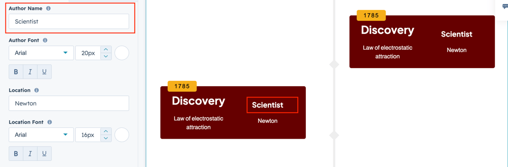
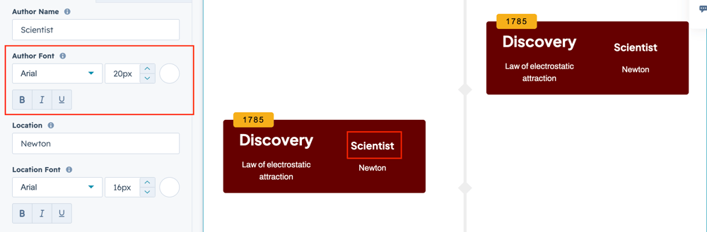
author-field

Users can also add author name in the respective text field.

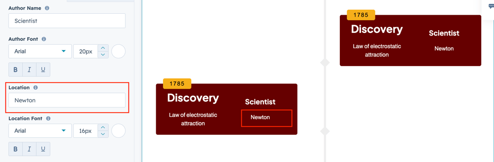
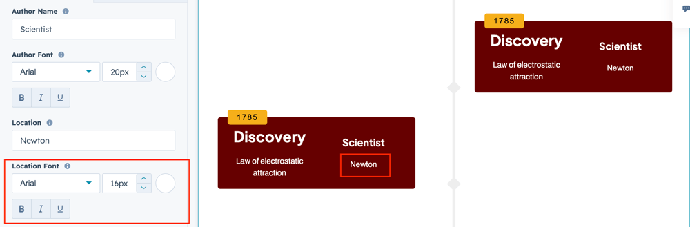
location-field

User can select the image position in the dropdown options field.

What customization styles options are available with the Discovery Timeline Cards Module?

below list of customization style options are available for Discovery Timeline Cards Module.

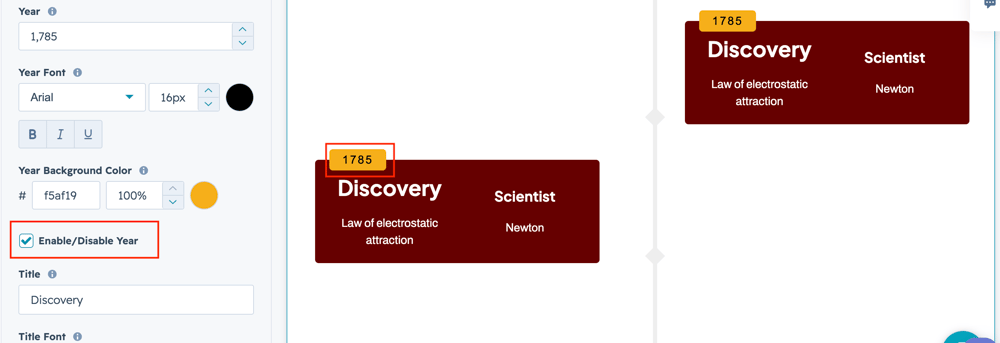
Year-styleusers can change year field font, color and background color.
Year-choice

users can enable or disable the year field using checkbox field.

title-style-1

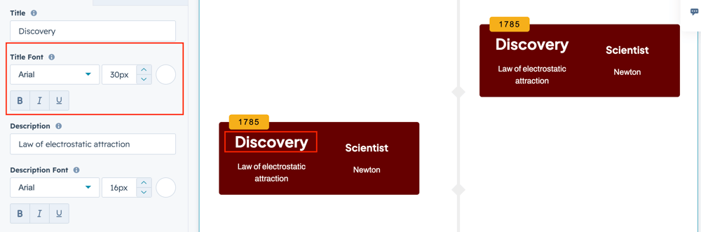
Users can change the title font and color.

desc-style

User can change description styles like font and color.

author-style

User can change the author styles such as font and color. location-style

Users can change the location styles such as font and color.

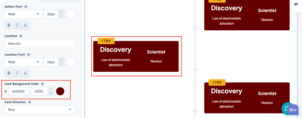
card-bg-2

Users can change card background color using respective color field.

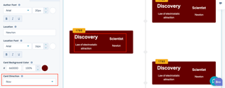
content-dir

Users can change the card content direction on horizontal or vertical position.

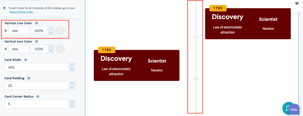
vertical-line-style

User can change the vertical timeline bar color using respective color field.

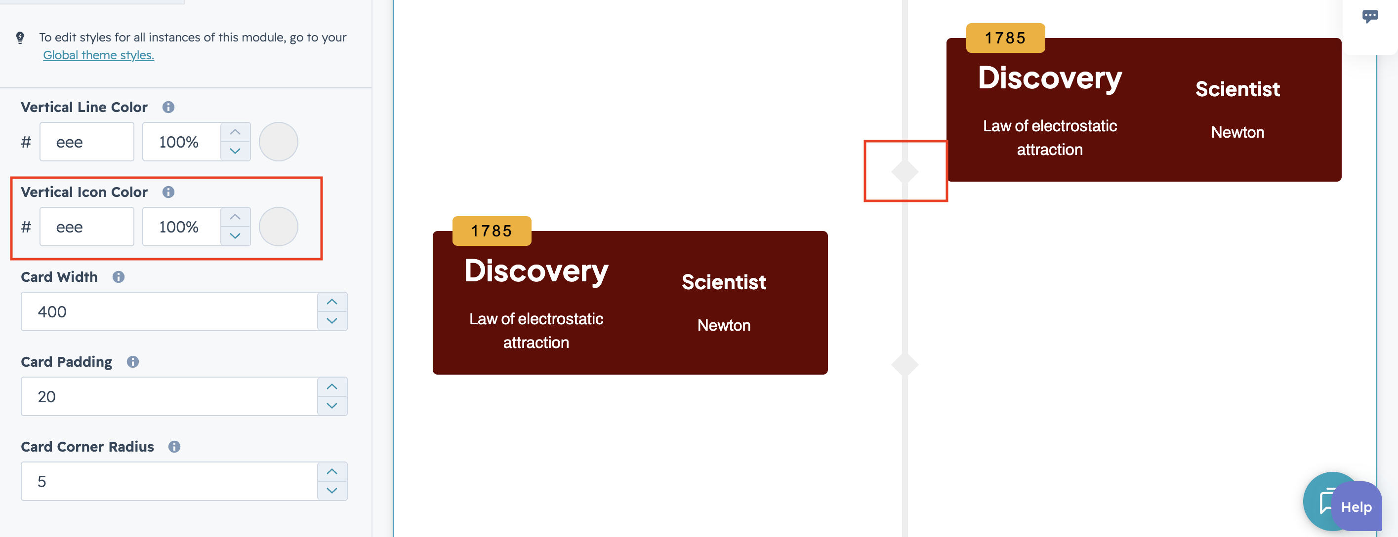
vertical-icon-style

User can change the vertical Icon color using respective color field.

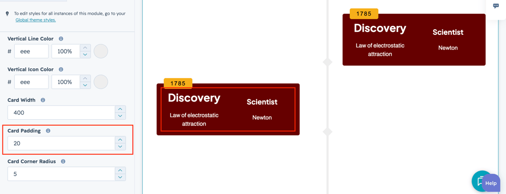
card-spacing

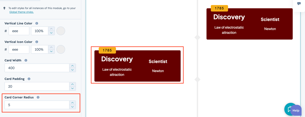
User can change the card spacing around the content using respective field.

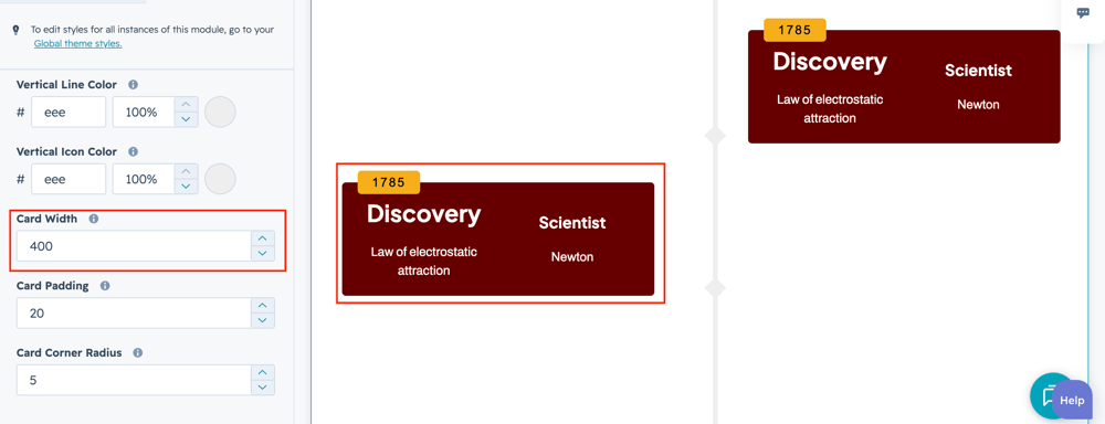
card-width-1

User can Adjust the card width using respective style field.

card-radius

User can Adjust the card corner radius using respective style field.


How can I get support?

If you're still having trouble or have any questions or feedback, contact at  hello@amwhiz.com