<img height="1" width="1" style="display:none" src="https://www.facebook.com/tr?id=920006783769328&amp;ev=PageView&amp;noscript=1">
Documentation

Dynamic Mega Menu


The Mega Menu Module is a dynamic, fully configurable HubSpot navigation component that provides an enhanced user experience through organized multi-column dropdown content. It enables administrators to manage navigation items, category links, featured content, and call-to-action buttons directly from the HubSpot page editor without modifying code.
Dynamic menu

What is the Dynamic Mega Menu Module?

The Mega Menu Module is a dynamic, fully configurable HubSpot navigation component that provides an enhanced user experience through organized multi-column dropdown content. It enables administrators to manage navigation items, category links, featured content, and call-to-action buttons directly from the HubSpot page editor without modifying code.
How does the Dynamic Mega Menu Module functionality work?

Navigation

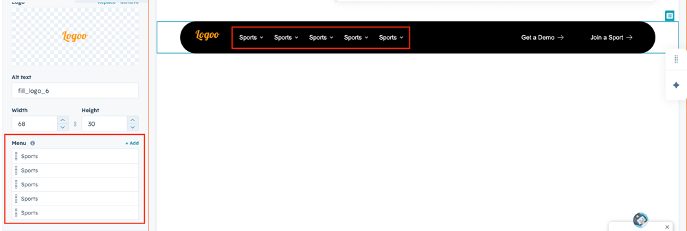
  • Displays the primary navigation menu with support for multi-level dropdowns.
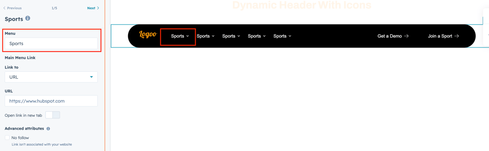
  • Each menu item can be configured with its own Mega Menu content.
  • Navigation links are fully editable from the HubSpot module editor.

Category Section

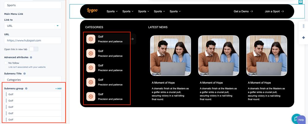
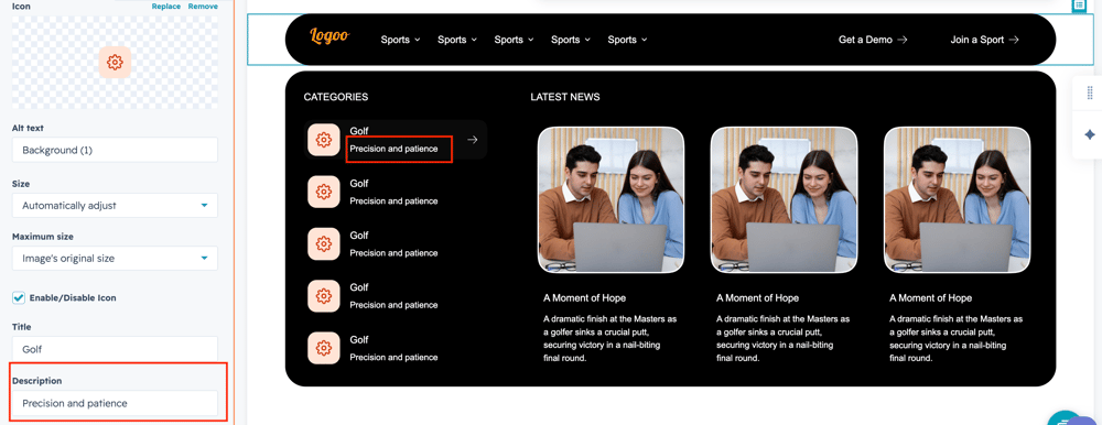
  • Displays a list of category items on the left side of the mega menu.
  • Each category supports:
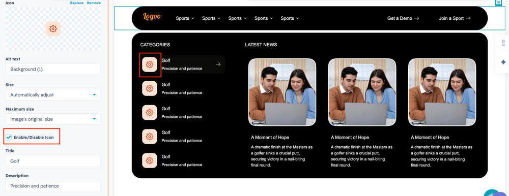
    • Icon/Image
    • Title
    • Description
    • Link URL
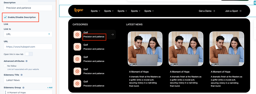
  • The Description can be individually enabled or disabled using the Enable/Disable Description toggle.
  • Clicking a category navigates users to the configured page.

Featured Content Section

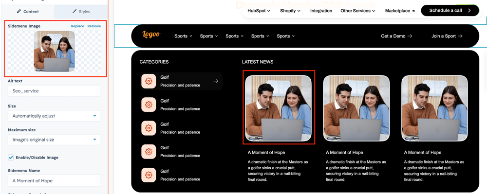
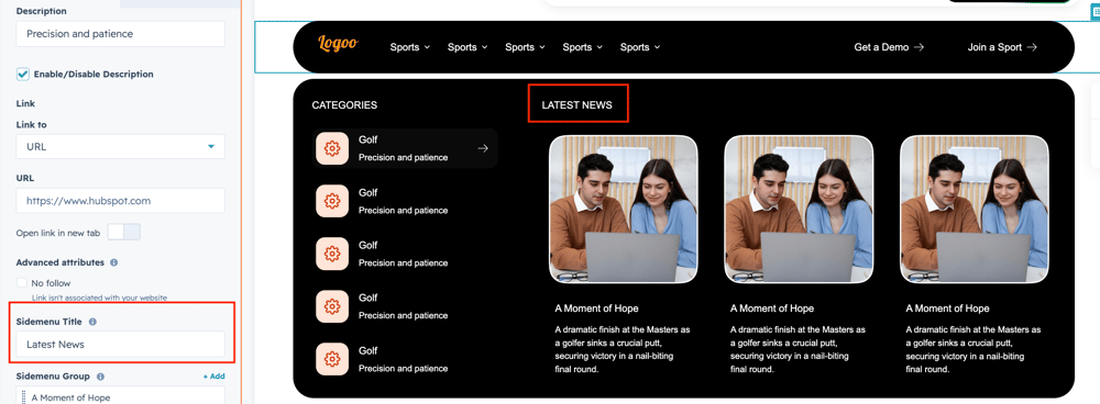
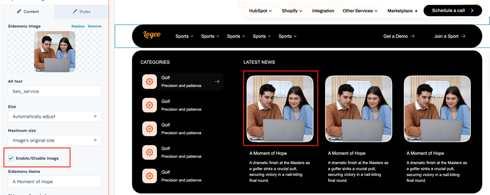
  • Displays featured content cards (Latest News) on the right side of the mega menu.
  • Each content card includes:
    • Featured Image
    • Title
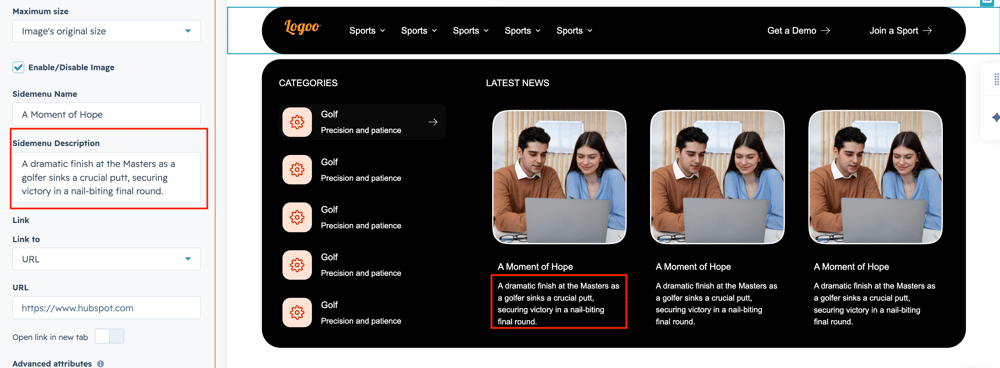
    • Short Description
    • Link
  • Multiple featured items can be managed using a repeater field.

Call-to-Action (CTA)

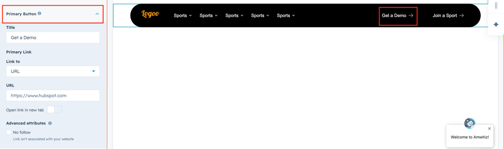
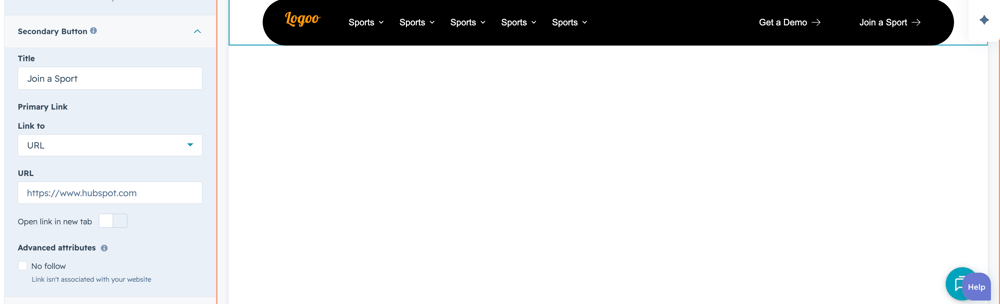
  • Supports multiple CTA buttons in the header (e.g., Get a Demo, Join a Sport).
  • Each CTA includes:
    • Button Text
    • URL
    • Open in New Tab option
  • CTA buttons are fully configurable from the module editor.

Content Management

  • All menu content can be managed without editing code.
  • Users can add, edit, remove, or reorder:
    • Navigation items
    • Categories
    • Featured content
    • CTA buttons

Responsive Behaviour

  • Desktop: Displays the full mega menu with multi-column layout.
  • Tablet: Automatically adjusts spacing and column widths.
  • Mobile: Converts the mega menu into a mobile-friendly dropdown layout.

Editor Controls

The module provides the following configurable options:

  • Logo
  • Navigation Items
  • Category Icon
  • Category Title
  • Category Description
  • Enable/Disable Description
  • Category Link
  • Featured News Cards
  • CTA Buttons
  • Link Settings
  • Open Link in New Tab
  • Styling Options (where applicable)

User Experience

  • Provides quick access to categories and featured content from a single navigation panel.
  • Highlights important content through featured cards.
  • Supports optional category descriptions for a cleaner interface.
  • Offers clear CTA buttons to improve user engagement and navigation.

What customization options are available with the Dynamic Mega Menu Module?

Below is a list of all the customization options available for the Dynamic Mega Menu

Content

Drag and drop the Dynamic Mega Menu into your desired location on the page.

Menu-group

The drag and drop the module default show review Dynamic Mega Menu group to change the content.

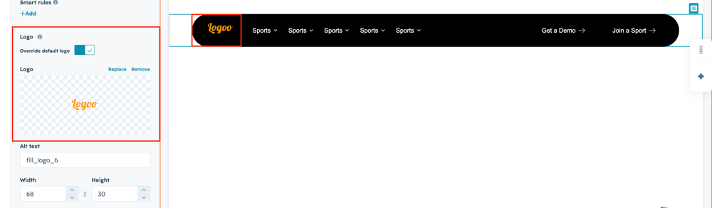
logo

User can add the company logo using respective logo field.
header-menu


Add header menu name using respective text property.

submenu-grp

Add submenu in the respective repeated field group.


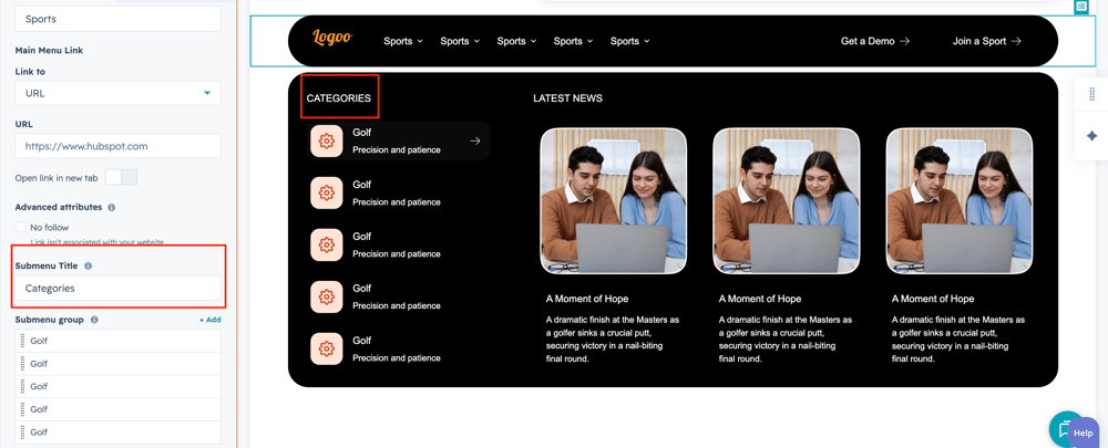
submenu-title

Users can add submenu category title on respective text field.


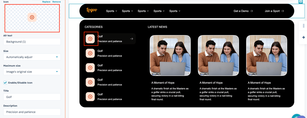
submenu-icon

Users can add submenu icon using image field.

submenu-desc

User can add the sidemenu title and description to using respective text field.

sidemenu-img

Users can add the right navigation menu image using respective image field.

sidemenu-title

User can add the right menu navigation title on respective text field.

sidemenu-desc

User can add the right menu description on respective text field.

primary-btn

User can add the primary menu title and link on respective text field.

secondary-btn

User can add the secondary menu title and link on respective text field.

icon-enable

User can choose enable and disable icon using check box field.

desc-enable

User can choose enable and disable submenu description using check box field.

sideimg-enable

User can choose enable and disable sidemenu image using check box field.

What customization styles options are available with the Dynamic Mega Menu Module?

below list of customization style options are available for Dynamic Mega Menu Module.

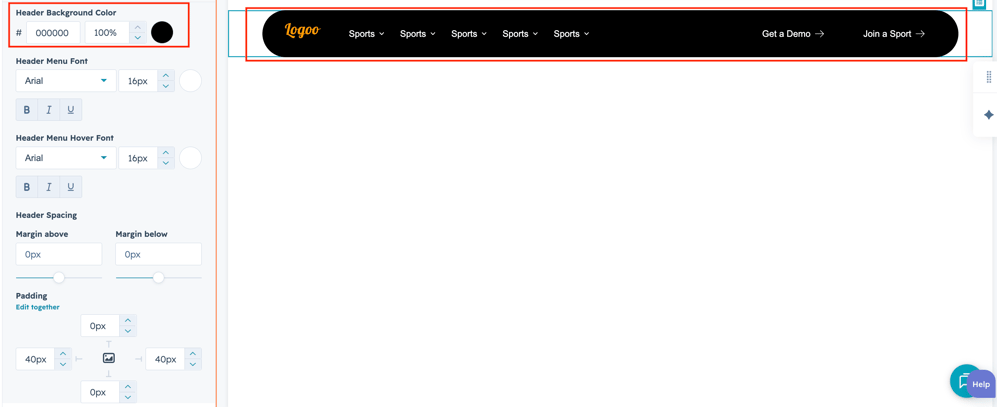
header-bgusers can change the header background color for using color field.
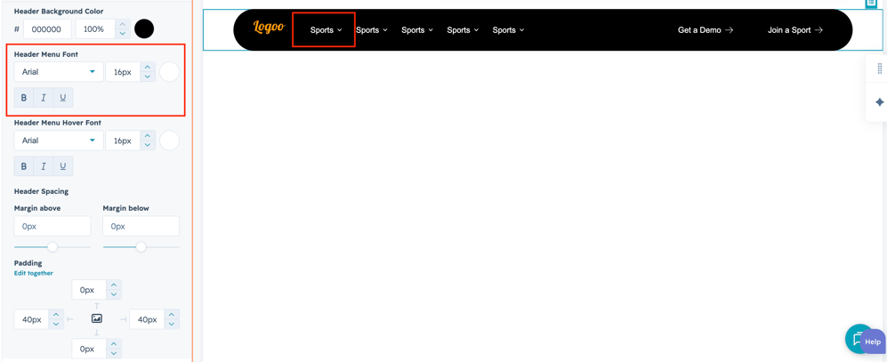
header-menu-font

User can change the header menu font and color using respective style field.

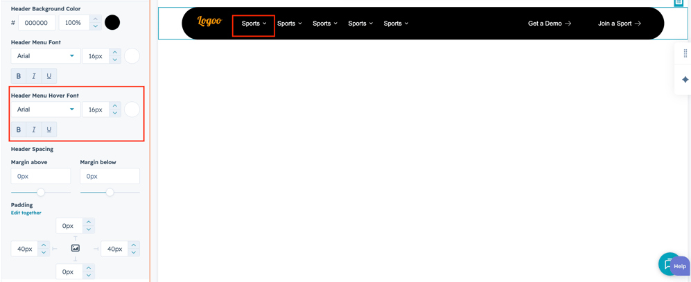
header-menu-hover-font

Users can change header menu title hover font and color using respective style field.

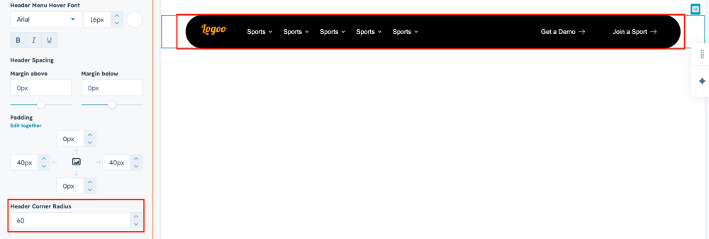
header-radius

User can customize the header corner radius using respective style field.

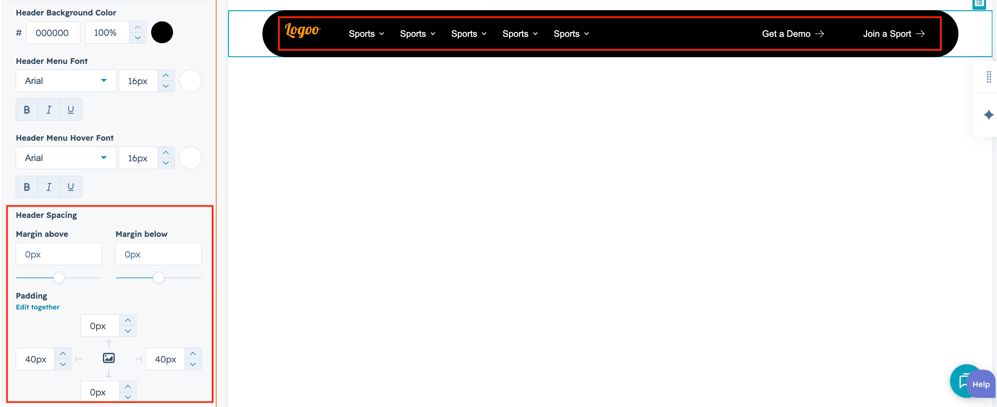
header-spacing

User can also customize space between menu and header using respective style field. leftmenu-style

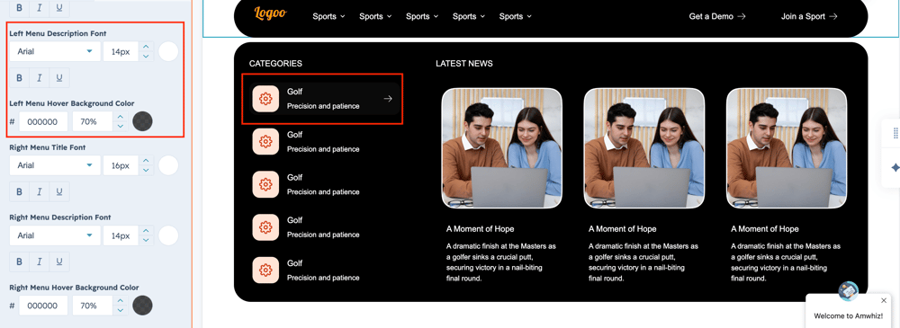
Users can change submenu styles such as font, color and background color using style field.

primarybtn-bg

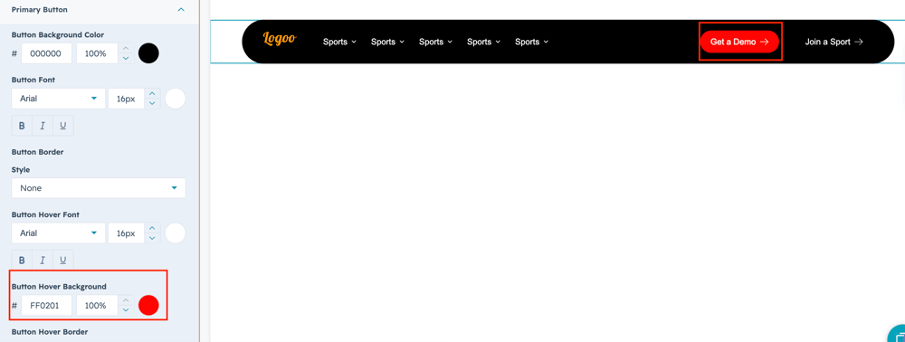
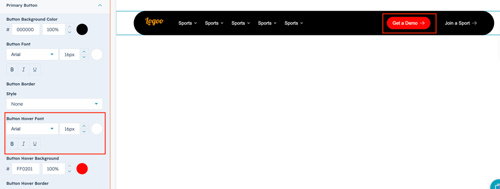
Users can change the primary  button font,color,border and background color using style filed.

 secondbtn-font

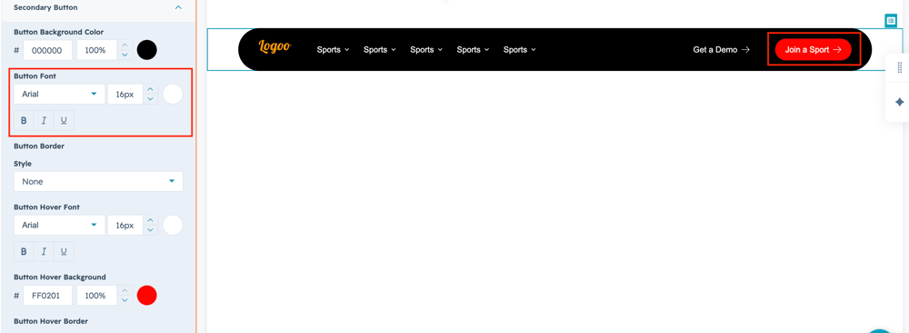
Users can change the secondary button font,color,border and background color using style filed.

rightmenu-style

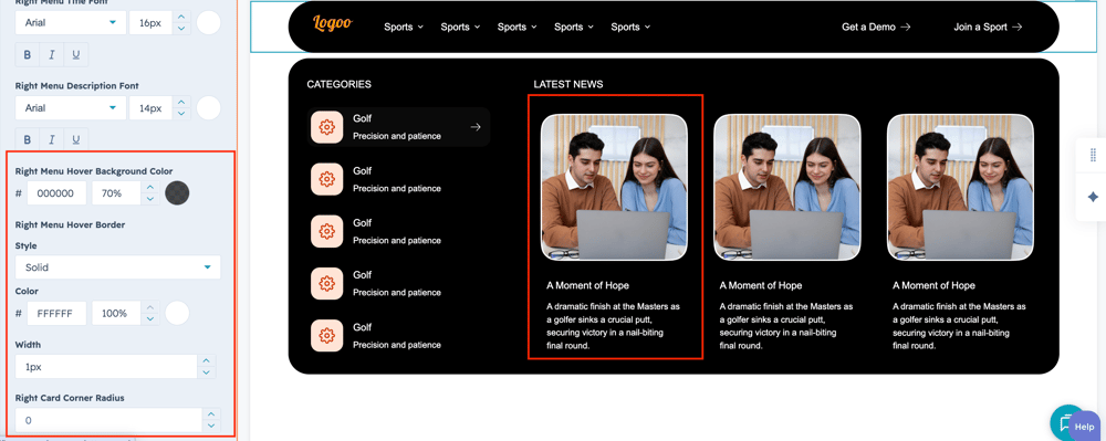
User can change the right side menu font,color,border and background color using style field.

primarybtn-hoverfont

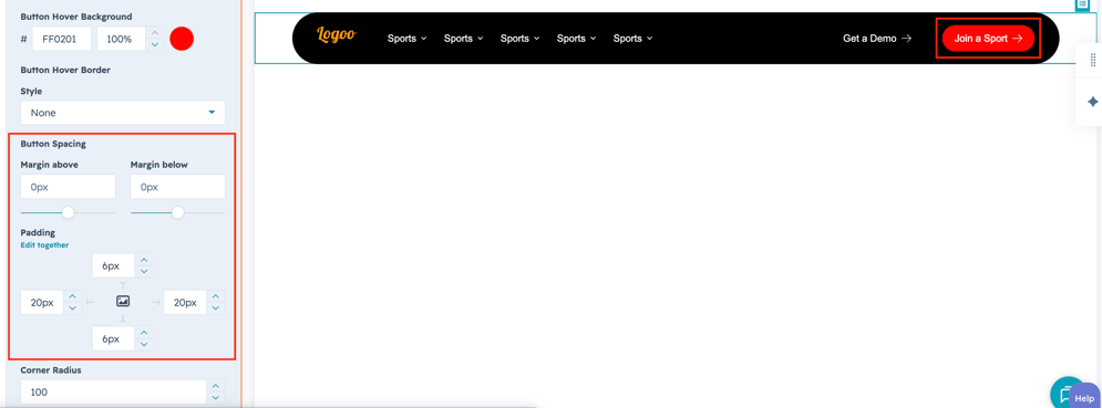
User can change primary button hover styles such as font,color and background color using style field.

secondbtn-spacing

User can customize the button spacing around the button title using style field.


How can I get support?

If you're still having trouble or have any questions or feedback, contact at  hello@amwhiz.com