<img height="1" width="1" style="display:none" src="https://www.facebook.com/tr?id=920006783769328&amp;ev=PageView&amp;noscript=1">
Documentation

Scroll Animation Cards


The scroll-based animations cards to enhance the visual experience of the cards as users navigate the page. Multiple animation effects have been added, including Flip Left, Flip Right, Zoom In, Slide Left, and Slide Right, creating a more engaging and interactive user experience. The animations trigger smoothly when the cards enter the viewport during scrolling, helping draw attention to the content without affecting page performance.
scroll-animation

What is the Scroll Animation Cards Module?

The scroll-based animations cards to enhance the visual experience of the cards as users navigate the page. Multiple animation effects have been added, including Flip Left, Flip Right, Zoom In, Slide Left, and Slide Right, creating a more engaging and interactive user experience. The animations trigger smoothly when the cards enter the viewport during scrolling, helping draw attention to the content without affecting page performance.
How does the Scroll Animation Cards functionality work?

  • Enable scroll-based animations for cards to create an interactive user experience.
  • Choose from multiple animation effects, including Flip Left, Flip Right, Zoom In, Slide Left, and Slide Right.
  • Animations are triggered automatically when the cards enter the viewport while scrolling.
  • Apply different animation styles to different card sections as needed.
  • Smooth transitions improve visual engagement without requiring user interaction.
  • Easy to configure and customize animation effects based on the design requirements.
  • Compatible with responsive layouts, ensuring animations work across desktop, tablet, and mobile devices.

What customization options are available with the Scroll Animation Cards Module?

Below is a list of all the customization options available for the Scroll Animation Cards.

Content

Drag and drop the Scroll Animation Cards into your desired location on the page.

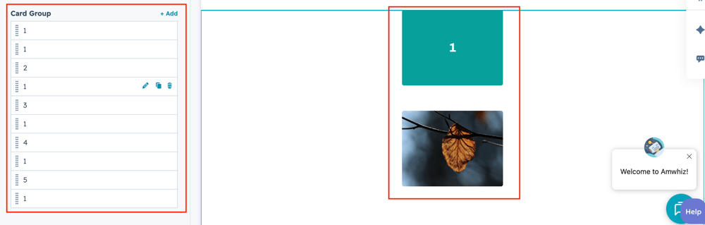
card-grp

The drag and drop the module default show review Dynamic Mega Menu group to change the content.

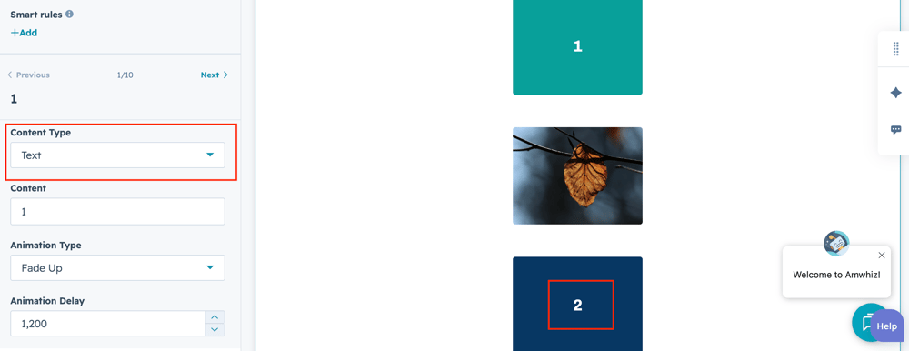
content-type

User can select the content type such image or text using respective select field.
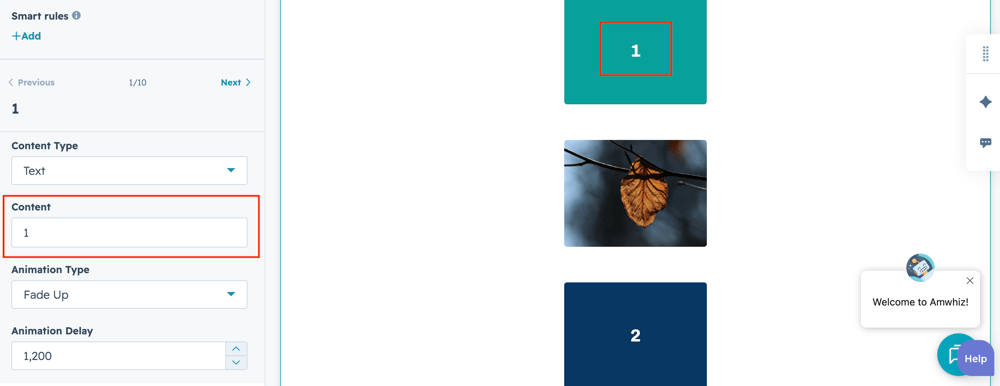
content


User can add the text on the respective text field.

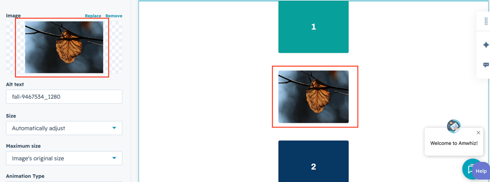
image-4

User can add the image on the respective image field.

What customization styles options are available with the Scroll Animation Cards Module?

below list of customization style options are available for Scroll Animation Cards Module.

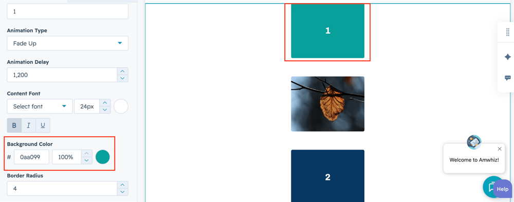
bg-colorusers can change the Card background color for using color field.
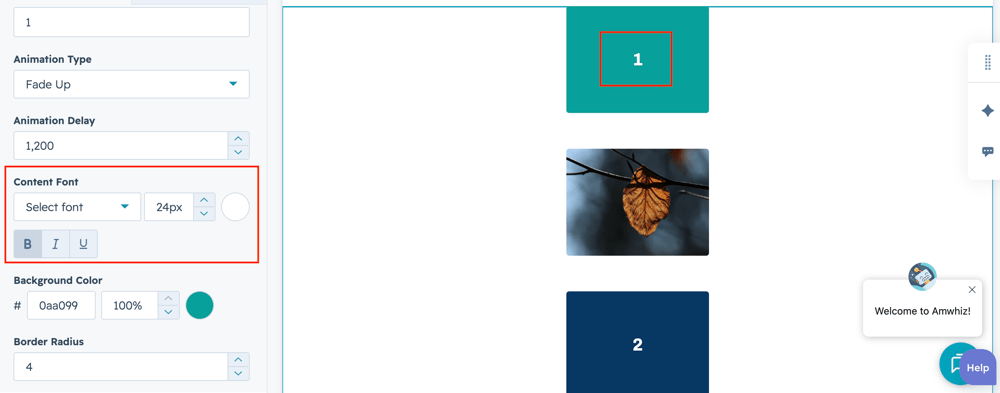
content-font-1

User can change the text font and color field using respective style field.

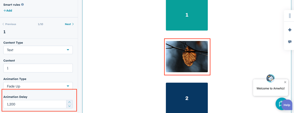
animation-delay

Users can change the Animation speed on each individual card using text field.

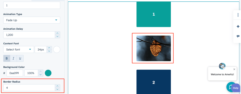
corner-radius

Users can change the card corner radius for each card using respective style field.

How can I get support?

If you're still having trouble or have any questions or feedback, contact at  hello@amwhiz.com